Forensic Architecture’s Investigation of Campesino Land Dispossession in Nueva Colonia, Colombia

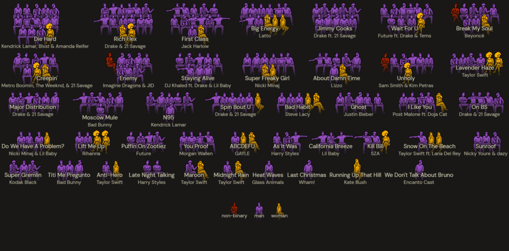
I felt particularly inspired by Noortje Marres’ guiding critical question with regards to data journalism: “What are the methods, materials, techniques and arrangements that we curate in order to create spaces where problems can be addressed differently?” The research agency Forensic Architecture has been involved in investigations into human rights violations through a deeply collaborative and situated practice of blending architectural analysis techniques, immersive technologies, and testimonial interviews. From their website, Forensic Architecture’s mandate is “to develop, disseminate, and employ new techniques for evidence gathering and presentation in the service of human rights and environmental investigations and in support of communities exposed to state violence and persecution… [a]rchitectural analysis and digital modelling techniques enable us to unravel that complexity, and to present information in a convincing, precise, and accessible manner–qualities which are crucial for the pursuit of accountability.”

Before I talk about Forensic Architecture’s investigation “Dispossession and the Memory of the Earth: Dispossession in Nueva Colonia”, I wanted to highlight two other data journalism investigations that I highly recommend to read about with regards to Israeli settler colonial occupation of Palestine, and the historical and ongoing violent displacement and ethnic cleansing of Palestinians: Living Archaeology in Gaza, and Sheikh Jarrah: Ethnic Cleansing in Jerusalem. Both of these investigations are incredibly relevant and can help us all learn more about the genocidal oppression of Palestinians in Gaza. It’s crucial that we be critical of the propaganda-filled news cycles that continue to circulate in mainstream media in the Global North. Similar questions raised in The Data Journalism Handbook can be applied to thinking critically about the news we consume: Which news do we continue to see, and whose news? Whose narratives are being pushed forward, and whose are being ignored? Remember… [news] are not “neutral and straightforward representations of the world, but [are] rather entangled with politics and culture, money and power” (Jonathan Gray and Liliana Bounegru, “Introduction” in The Data Journalism Handbook).

“Dispossession and the Memory of the Earth: Dispossession in Nueva Colonia” focuses on the violent and hidden dispossession of campesino land in the Colombian region of Urabá Antioqueño. The purpose of the project is to show the various actors involved in land dispossession through concerted efforts of “armed repression, massacres, and terror spread by private paramilitary forces, serving local and international banana producers under the protection of the Colombian military.” Forensic Architecture used 3D architectural technologies to digitally reconstruct 100 km2 of stolen and threatened land through situated testimony. The immersive nature of the technologies used help to provide affected campesinos an opportunity to archive and re-experience temporalities of “not only places that were lost, but also their farms which they have struggled to hold on to.” The lack of focus on purely quantitative data (from aerial and satellite imagery + financial data from 1955 to present) through interviews serves to empower disenfranchised campesinos, reinforces their humanity and embodied presence on their dispossessed land, and places value on their testimonies as a foundation for data journalism investigations. Forensic Architecture’s investigation is placed within the context of oppression on global scales, as shown in the following quote highlighting the role of the Israeli Defense Forces in developing techniques for violent policing and surveillance: “We interviewed a judge who investigated the massacres, and who was forced into exile after identifying the former paramilitaries who committed the massacre, and Yair Klein, a former Israeli military officer who trained them.” “Dispossession and the Memory of the Earth: Dispossession in Nueva Colonia” is a powerful investigation that exposes the “agricultural canal systems of banana businesses and other environmental elements… used by landowners to flood the fields of campesinos, and contribute to the destruction of their fields, and eventual dispossession,” both through a comprehensive 24-minute video shared through exhibitions, events, and press, and an interactive web platform containing a cluster visualizations, timeline, and map for multiple ways of engaging with the scale of land dispossession that took place.

Analyzing Migration Through Data

Recently, while reading various articles as part of understanding topics in my Demography course, I stumbled upon a compelling piece of data journalism by The New York Times titled “Mapping Migration in the United States”. It wasn’t just another article. Instead, it employed interactive maps to weave a tale of America’s internal migration, painting a picture of how and where its citizens have moved over the years as well as those in a state who are identified as being foreign born. Using a deep dive into census data, this piece narrated the American journey, county by county.

Unpacking the Article’s Worth

What struck me about this article was its straightforward yet profound approach to storytelling. At the heart of quality journalism is the ability to relay information in a manner that resonates, informs, and engages. This article does precisely that. America, in all its sprawling vastness, has a diverse populace whose migratory patterns have profound implications—from policy decisions to economic trajectories.

Reflecting upon historical accounts, like Henrietta Wood’s narrative in “Data: the New Cotton,” reveals the deep-seated importance of understanding such migratory shifts. Henrietta’s experiences, tied intricately to the migrations forced upon her, provide a lens into the societal, economic, and personal implications of movement.

Yet, an essential aspect of data journalism to consider is “Data Absenteeism.” In this context, certain groups, especially undocumented immigrants, might not be reflected in datasets due to their invisible status within official records.

Who Benefits from this Narrative?

The scope of readers who might find value in this is broad. Academic circles, especially historians, sociologists, and demographers, will find a treasure trove of insights into patterns of movement. Policymakers can get crucial information to guide their decisions. Meanwhile, everyday readers get a lens to trace how migration works in the country. or simply fathom the ebb and flow of the American population.

Beyond Mere Data: A Broader Implication

This isn’t just an article—it’s a call to introspection. It prompts readers to think, converse, and understand the nuances of societal shifts. Against the backdrop of modern-day challenges, such as the rise of surveillance capitalism, there’s a clear undercurrent. Yesterday’s migrations, influenced by societal constructs and economic demands, echo today’s digital migrations. Today, it’s not just about where we physically move, but where our data traverses in the vast digital expanse.

Economic structures of the past were often driven by tangible commodities like cotton. Today, intangible data steers the ship. But history has lessons to offer: unmonitored and unchecked movements, be they human or data, can lead down a path of misuse and exploitation.

The article has offered more than a data-driven exposé. It’s a reflection, a lesson, and a bridge to understanding our past, present, and potentially our future. When data journalism is executed with such finesse, it doesn’t merely inform—it motivates introspection and action.

The rarity for a hit song to be credited to an all-women songwriting team.

Some data journalism projects that I particularly enjoy are pieces from The Pudding. The Pudding’s approach is partially influenced by community submissions and is experimental. One piece that I found impactful was, This is how rare it is for a hit song to be credited to an all-women songwriting team. The project skillfully blends dynamic visuals with data on the gender composition of song writers from top Billboard Hot 100 songs in recent years.

The project employs the usual vertical scroll method to move readers through the story. One of my favorite ways they expand on this feature is using background and foreground. They use it to highlight how male dominated commercially successful song writing is.

Shows breakdown of writers for popular hit songs
Male writing teams
Kat Bush,"Running up that hill"as the only songwriting team that was all women.

As the project unfolds, a running tally can be seen at the lower left that demonstrates that the further back, starting in 2021, we go in years, the wider the disparity.  

Disparity in song writing teams

The latter half of the project details the rarity of hit songs where a woman is the sole writer of a song for a man. And specifically calls out barriers that women have faced in getting recognition in the song writing space, and the music industry at large. This quote was shocking to me:

“From a nameless male author in 1860 being disturbed by women having to straddle a cello in order to play it to composer Gustave Kerker expressing his distaste for how certain instruments distorted female faces to critic George Upton writing in his book Woman in Music that women’s emotions made them great song interpreters (i.e., vocalists) but not great songwriters, men have continually tried to define what is appropriate for women to do in music.”

The level of interactivity of this project makes it especially engaging for narrating the story. While it is largely a linear experience, the final sections allow users to search all the data compiled. The creators share a breakdown of methodology and a link to the data sheet containing all the data.

tool to explore top 5 hots

I appreciate that, while the focus of this project is on lack of female representation in songwriting, non-binary identities were also included. It calls to mind themes presented in some of the readings on how one data set can highlight other facts or narratives within the data they you may not have been seeking. The creators of the piece took care to acknowledge that to the best of their abilities and with the data available, they aimed to accurately represent those who identify as non-binary. Pronoun specifications were not always present in the data available for song writer credits; so, they relied on how that writer seemed to identify themself in publications and platforms.

Like La Nacion, The Pudding works less like traditional news organizations. The lack of immediate urgency lends to the ability to create interesting pieces that can touch on data that may not seem as important in a current news cycle.

Unseen Emotional Information: Why Data Should Not Be Limited to Numerical Representation

            Link to Article

            One of my very first exposures to Data Journalism was the article, “Life in the Camps: The Rohingya Crisis” by Simon Scarr and Weiyi Cai. I remember the emotional impact of seeing the rapid expansion of settlement camps over time. This emotional response could never have such an impact if it were to be displayed as charts or numerically represented. It was a reminder that behind all the data, the numbers, the computations and trends in the data that there are human beings; people who experience the gamut of human emotions just like you and me.

            This emotional component is where I believe this article provides so much value– much more than I can put into words. While of course, any article that provides exposure to the plight of a group of individuals provides a great value to society, but if the article can transcend its numerical representations, not only is it of greater value to the reader, but also the ones that are personally affected.

            If you are unfamiliar with the Rohingya, I will provide a an extremely non-exhaustive summary: The Rohingya are an indigenous ethnic group belonging to the northern region of Myanmar. In the 1980s they were essentially labelled as foreigners in their own country, denying the freedom of movement and any basic human rights. They even banned the use of the “Rohingya” and referred to them as “Bengalis” essentially ascribing them to the neighboring sovereign state. Myanmar, and then Burma, has been accused of Ethnic Cleansing and genocide several times in the past but It wasn’t until 2017 when the military, who was essentially controlling the “democratic puppet state” escalated conflict, and the issue saw increasing international attention.

            It is here where data journalism plays such an important role in reporting. The article presents images of the same location over an extremely short period of time (three months!). It shows how expansion of displacement camps and how much they’ve grown over time. But the authors do not stop there. They present how these mini cities lack access to roads and how they must rely on bamboo bridges to transport essential items to their camps. They show the extent of overcrowding by providing visual maps of the limited access to latrines per clustered shelters. They even go as far to show that not even every can access the 7,839 latrines located both within “official” limits of the camp and outside surrounding clusters. The article even doesn’t stop there, they provide many instances and issues these camps are facing, all accompanied by geospatial pictures, and snapshots of life within the camp. If this information were simply presented on a chart of a table, it would not produce such visceral “emotional information” that the images bring forth.

            By introducing an emotional component, the authors can, in my opinion, provide more information on the data. Although it is intangible, and might be considered a bias, this emotional aspect introduces concepts of humanity, of struggle, of empathy—this numbers and figures tend to erase. This in turn benefits those experiencing this tragedy and the reader. It creates a sense of urgency and lowers the threshold of inhibition to take a clear stance. I feel when concepts are displayed on such a level, it is easier call out and ask International Leaders to address the issue, and that is exactly what happened. Unfortunately, Myanmar experienced another coup in 2021 resulting in the dissolution of the pseudo-democratic state, and much of what these people are facing rarely comes to light. But this article goes to show how much of an impact the visualization of data can have, compared to numbers and figures and how it can inspire global movements and create accountability.

Following the Money: Doctors and Healthcare Industry Payments

In the world of data journalism, “We Found Over 700 Doctors Who Were Paid More Than a Million Dollars by Drug and Medical Device Companies” stands as a shining example of impactful storytelling. Authored by a team of investigative journalists, this article delves into the financial relationships between physicians and the healthcare industry.

The article meticulously investigates the financial ties between physicians and drug and medical device companies. It delves into data obtained from multiple sources to reveal that over 700 doctors received payments exceeding a million dollars from these entities. The story highlights the extent of these financial transactions, exposing potential conflicts of interest and ethical concerns within the medical field.

The article’s value lies in its ability to shed light on the financial relationships between healthcare professionals and the industry, raising awareness about potential biases and conflicts of interest. By presenting these findings, the article empowers patients, policymakers, healthcare professionals, and the general public to make informed decisions regarding their healthcare and advocate for transparency and accountability within the healthcare system.

The primary purpose of “We Found Over 700 Doctors Who Were Paid More Than a Million Dollars by Drug and Medical Device Companies” is to expose the significant financial relationships between physicians and healthcare companies. By providing transparency on these financial transactions, the article aims to challenge the status quo, prompt regulatory reforms, and advocate for a healthcare system where financial interests do not compromise patient care and medical decision-making.

This article is an exceptional example of data journalism that confronts critical issues within the healthcare industry. Its value in exposing financial ties between healthcare professionals and companies, and its potential to drive reforms and transparency, makes it an impactful piece of journalism. The article empowers individuals to advocate for a healthcare system built on trust, integrity, and the primacy of patient welfare.

Data Journalism “Mapping where the earth will become uninhabitable”

The article Mapping where the earth will become uninhabitable is a data journalism piece that uses climate projection models to show areas around the globe which will become unlivable and the population which will be affected. The 3D interactive visualization uses different climate change issues (heat, floods, hurricanes, and water scarcity) with the data plotted on a map as colorful hexagons which represent an area of 12,000 square kilometers (the size of NYC). Because it is 3D visualization, the population affected is shown as the height of the hexagon. The purpose of this article is to educate and advocate for urgent action to be taken to mitigate catastrophic damage to these regions and populations.    

I was particularly drawn this article because it is beautifully presented. It catches the reader’s eye. The bright colors of the globe contrasted on the black of space with hexagons protruding at varying heights is very attractive. It reminds me of what I would see at an exhibit at the Natural History Museum. Past the bright colors, it continues to draw the audience in via its scrollytelling format and provides an interactive exploration option for the readers to further engage. Through these methods the audience is hooked and will be more likely to consume the information.   

Data visualizations are important for many reasons. One being they help the audience understand and see information in new ways. I believe people learn in different ways and providing different sources for consuming information is important to reach the public. This piece also includes a raw text link without a visualization if a consumer prefers a traditional article or does not have a web browser available. The article benefits a large audience and a wide range of ages and backgrounds. It presents information in an easily understood manner for those that may not be subject experts and it is written in a style that provides the essential information in small consumable pieces.   

A few valuable factors of data journalism that this article includes are providing transparent data sources, data analysis that uncovers insights of the potential peril of populations, beautiful data visualizations to draw the reader in and audience engagement. But a critique of this article is that it does not take that extra step of and it appears to lack community engagement. Although it is providing consumable data for public awareness, it seems to stop at the point of only providing information without suggestions or resources for solutions. However, I did not investigate if this article was used past general education. Overall, the article was beautiful and insightfully provided information on a complex matter.  

Constructing Data Narratives: Challenges and Opportunities

This week’s reading delves into the expansive realm of data journalism, commencing with a manifesto that outlines twelve challenges crucial for critical data practice. These challenges scrutinize data journalism’s capacity not only to mold relationships among diverse stakeholders but also to craft representations of the world. They span the wide spectrum of data collection, public involvement, objectivity, social justice, and the art of storytelling with and about data.

In the subsequent but interrelated narratives, the compendium explores themes including data collection, data cleaning or standardization, data context, measurements, algorithms, numbers, stakeholder validation, stakeholder participation, dissemination, data infrastructures like databases, the dynamics of numbers, indigenous data sovereignty, and collaboration, among others.

For the sake of structure and clarity, I will delineate the discussion into three major themes: data collection and integrity, data ownership, and the narrative aspects of working with data.

One significant insight from this week’s reading is that data isn’t always readily available to fulfill the needs of data journalists. Even when data appears accessible, it may lack completeness, currency, or proper formatting. Consequently, data journalists frequently find themselves compelled to construct their datasets to convey the intended narratives. A multitude of approaches was shared for this purpose, ranging from basic online searches to more intricate methods such as undercover data collection. Importantly, these projects often require collaboration with readers, volunteers, experts, indigenous communities, and power structures. Additionally, ensuring data integrity emerged as a paramount concern. Rigorous data quality assurance processes, including field revisits, triangulation, expert and community member verification, and adherence to predefined data cleaning standards, are essential to maintain the accuracy and trustworthiness of data-driven narratives.

The notion of indigenous data sovereignty raises complex questions regarding data ownership, control, harm, and collective benefit. It reminded me of how design justice, in this case, maybe data justice principle could be applied to protect the rights of indigenous people “to own, control, access and possess data that derive from them, and which pertain to their members, knowledge systems, customs or territories.”  It was revealed that Western data protection models are ill-suited for safeguarding indigenous data sovereignty since they primarily focus on individual rights, whereas indigenous data is collective. Data journalism emerges as a promising avenue for challenging this status quo by empowering indigenous peoples to frame their narratives and hold those in power accountable.

The most captivating aspect of this week’s reading for me revolves around the art of telling stories with and about data. The concept of “narrating a number” is particularly enlightening, highlighting how numbers, despite their sociotechnical characteristics, can be potent tools for obfuscating real social issues. The text elaborates on two fundamental speaking positions in data journalism: the Visual Embedded within Narrative and the Narrative Embedded within the Visual. The former deploys visual representations to support or illustrate narrative points, with the narrative being the primary focus. In contrast, the latter prioritizes visuals, using narrative to explain or provide context. This fluid approach allows data journalists to effectively communicate their ideas and engage their audience, recognizing that both narratives and visuals are invaluable tools in data journalism.

This has been a profoundly enlightening journey, prompting me to contemplate the multifaceted challenges and ethical considerations inherent in this field. I found the issue of data integrity particularly relevant, as it emphasizes the rigorous processes necessary to ensure that data-driven narratives are not only compelling but also trustworthy. Furthermore, the exploration of indigenous data sovereignty raises crucial questions about whose voices and stories are heard in data journalism, challenging us to consider how we can empower marginalized communities to take control of their narratives. The concept of “narrating a number” and the two fundamental speaking positions provide a fresh perspective on the interplay between narratives and visuals. It reminds us that data journalism is an art that requires a delicate balance between storytelling and visualization.

“Tracking Australia’s Progress on the Climate Crisis and the Consequences of Global Heating” – The Guardian

I particularly enjoyed The Guardian’s article on “Tracking Australia’s Progress on the Climate Crisis and the Consequences of Global Heating.”

It is a very salient, timely article about climate change in Australia. It is important to remember that the seasons are reversed in the Southern Hemisphere, and Australia is just entering what is – paradoxically – likely to be both one of the hottest summers on record and the coolest summer for the foreseeable future.

Climate change is only worsening, as depicted by an alarming countdown clock that details how many tons of carbon dioxide have been emitted by Australia alone in the limited time one has been on the page, as well as how long it will take before Australia uses up its allotment of carbon emissions, as described by Paris agreements. The clock ticks ominously, always in motion, and the numbers are alarming. Our time is running out like sand in an hourglass to fix the problems wrought since the Industrial Revolution – and this serves as a visceral reminder.

Carbon Countdown Clock

This article provides data that can be of use to educators, students, advocates, environmentalists, and citizen scientists. Environmental justice activists can use these numbers to present their case with all due urgency. Governmental officials can use it as justification for more aggressive carbon offset and emission reduction policies.

Numbers alone cannot tell this story, though they are nevertheless needed, useful, and relevant. Despite its timeliness, the one notable thing this article does not do is appeal to pathos – it glosses over the sheer suffering caused by anthropogenic climate change. A chart towards the end of the article describes the dangers faced. Wildfires are listed as being “more severe or more likely to occur,” along with drought across the continent, more extreme cold freezes and hotter summers throughout the nation as well as maritime heatwaves in the oceans off Northern Australia.

Yes, this data-based article appeals to the logical mind. However, I believe there must be an attempt made to petition our common humanity as well. Our minds are simply not evolved for comprehending such staggeringly large numbers as 10.4 billion tons of carbon dioxide, which was and remains Australia’s total “fair share” allotment for the years including and between 2013 and 2050.

Please allow me to share an excerpt of the end of Zbignew Herbert’s powerful poem, “Mr Cogito Reads the Newspaper.”

I believe that what Herbert calls “the arithmetic of compassion” plays a large role in data journalism and must be carefully weighed and considered to avoid dehumanizing people into datasets while still telling the stories that must be told and brought to public attention.

Public Interest Technology Graduate Career Fair

Date & Time
Tuesday, October 17, 2023
10:00 am – 2:00 pm ET

Location
CUNY Graduate Center, Concourse Level

REGISTER

Calling all CUNY graduate students! Prepare to dive into the dynamic world of Public Interest Technology (PIT) at the CUNY Graduate Public Interest Technology (PIT) Career Fair. This event is your gateway to connecting with leading employers in NYC’s PIT sector. 

A light breakfast and lunch will be served to all participants. Robert Domanski, PhD, Director of Higher Education, NYC Mayor’s Office of Talent and Workforce Development, will open the event with remarks on “Algorithmic Bias and the Emerging Policy Landscape in Artificial Intelligence.”

  • About Public Interest Technology (PIT): PIT represents the intersection of innovation and social good. It encompasses organizations ranging from companies to NGOs, governments to civic and cultural heritage institutions. PIT organizations conceive, develop and implement technological solutions aimed at serving the public’s welfare. This expanding field also comprises individual roles within larger entities, oriented towards harnessing technology advances, addressing potential technological pitfalls, and leveraging the potential of data collection, analysis, and artificial intelligence.
  • Why PIT Matters: PIT work inherently revolves around people and communities. It is driven by an unwavering commitment to our broader social well-being. It stands as a testament to using technology for the greater good, emphasizing ethical, inclusive, and community-driven outcomes.
  • Your Path into the Sector: Embark on various pathways into this impactful sector. PIT welcomes graduates from diverse disciplines, including humanities and social sciences. The range of transferable skills ensures that, regardless of your background, you can contribute to shaping a brighter future for all.
  • Register:  Students from Handshake campuses can register via Handshake. (GC Students: Here’s how to claim your account if you’ve never logged in.)  This also includes: School of Labor and Urban Studies, Graduate School of Public Health and Health Policy, The Craig Newmark Graduate School of Journalism at CUNY, Baruch College, Zicklin School of Business, and the College of Staten Island.
  • Register: Students from other CUNY campuses can register using this form.
  • Any problems or questions? Email [email protected]

Registered employers include:

  • The Information Lab: The Information Lab helps people make sense of data using Tableau and Alteryx. Our career acceleration program, The Data School, pays you to become a world-class data visualization and analytics expert. We recruit 8 new people to join The Data School every four months.
  • Thalo Labs: An NYC-based company on a mission to transform the built environment into a powerful tool for fighting climate change. Thalo Labs designs, develops, and deploys carbon mitigation solutions for the built environment. We partner with property owners and operators to deploy our advanced measurement and carbon capture technology in their buildings, offering them and their tenants practical ways to significantly reduce onsite greenhouse gases in real time.
  • Partnership for Public Service: The Partnership for Public Service is a nonprofit, nonpartisan organization that strives for a more effective government for the American people. Through a combination of cutting-edge research, innovative legislative initiatives, leadership training and campus-based outreach programs, the Partnership advocates reforms to build a more effective government for the American people. The Partnership is recruiting for the Future Leaders in Public Service Internship Program and the Cybersecurity Talent Initiative.
  • New York State Department of Civil Service: As the central personnel agency for New York State government, the Department of Civil Service helps employees build skills and create opportunities for workplace success. The agency also has the responsibility for recruiting a new generation of workers who will lead New York State for decades to come. The Department of Civil Service encourages jobseekers from diverse backgrounds to consider joining the New York State workforce.
  • Coding it Forward: We’re a nonprofit by and for early-career technologists creating new opportunities and pathways into public interest technology. Learn more at codingitforward.com.
  • 32BJ Benefit Funds: Building Services 32BJ Benefit Funds is the umbrella organization responsible for administering Health, Pension, Retirement Savings, Training, and Legal Services benefits to over 100,000 SEIU 32BJ members. Through our commitment, we embody five core values: Flexibility, Initiative, Respect, Sustainability, and Teamwork (FIRST). By following our core values, employees are open to different and new ways of doing things, take active steps to improve the organization, create an environment of trust and respect, approach their work with the intent of a positive outcome, and work collaboratively with colleagues.

This event is made possible through support from the Public Interest Technology University Network Challenge Fund, a project under the aegis of the New Venture Fund. Generous backing from esteemed entities like the Ford Foundation, Hewlett Foundation, Mastercard Impact Fund via Mastercard Center for Inclusive Growth, Schmidt Futures, and The Siegel Family Endowment fuels the Public Interest Technology University Network’s challenge as well as career fair grants. 

Challenging Systemic Bias in Design: A Critical Examination

In “Design Justice,” the overarching theme of “FREEDOM FROM BIAS” takes center stage as a fundamental pillar of designing for the public. Costanza-Chock embarks on a mission to shed light on the often unintended but profound impact of design choices, revealing their potential to reinforce oppressive systems. While acknowledging that most modern designers don’t consciously perpetuate these systems, the author asserts that their decisions frequently unintentionally contribute to the matrix of oppression. Consequently, the book advocates for the deliberate institutionalization of a framework that compels designers to thoughtfully consider the broader societal implications of their creations. This entails active engagement with the communities that interact with the resulting products, including both present and potential users.

Costanza-Chock’s exploration commences with an in-depth examination of the concept of design, aiming to formulate a practical definition. While acknowledging that humans are natural designers, the author narrows their focus to professional designers who craft for the public. Design is portrayed as both a verb and a noun, encompassing the manipulation of future objects and systems. This process involves an array of tools, ranging from specialized software to traditional wisdom.

Throughout the book, Costanza-Chock expertly dissects key concepts such as design justice, intersectionality, the matrix of domination, and affordances. The author effectively demonstrates how design plays a pivotal role in the allocation of benefits and burdens among diverse groups of people. Drawing from personal experiences as a member of a minority group and highlighting institutional biases stemming from design choices, Costanza-Chock illustrates how these biases manifest as disaffordances. These disaffordances often translate into microaggressions experienced by marginalized communities, who are simultaneously more susceptible to severe forms of oppression.

Addressing the systemic biases on a significant scale necessitates concerted and organized efforts. Costanza-Chock argues that achieving design justice requires a coalition comprising designers, developers, social movement organizations, policymakers, and everyday individuals. The author proposes several remedial design concepts that could contribute to tackling this challenge effectively. These include value-sensitive design, participatory design, designing for accessibility, inclusive design, universal design, and the need for retooling for design justice. A recurring theme is the indispensable role of communities in driving the desired changes in design decisions and outcomes.

However, some questions linger in the reader’s mind. Costanza-Chock’s call for systemic change raises concerns about who bears the additional costs associated with rectifying these issues. In a landscape dominated by profit-driven private sector entities, the distribution of these costs remains a significant challenge. The book leaves readers pondering, “Who should foot the bill for fixing a biased system: the community of users, the designers/manufacturers, the government, or civil society?” A classic example is the limited availability of books translated into Braille for the visually impaired. Who should shoulder the responsibility and cost: authors/publishers, the user community, the government, or civil society? This is just one of many complex examples of fixing a systemic bias.

Additionally, some of the author’s proposals might seem overly utopian. For instance, the expectation that designers should engage not only with current users but also with potential users raises practical challenges. Defining a representative community of potential users could prove daunting in the long run and may lead to analysis paralysis, potentially stifling innovation and development.

In conclusion, “Design Justice” by Sasha Costanza-Chock provides a thought-provoking exploration of the critical intersection between design, justice, and societal impact. The book calls for a conscious examination of design choices and their consequences, underscoring the importance of involving affected communities. While it offers compelling insights and innovative solutions, it also leaves readers contemplating the practical challenges and costs associated with implementing these ideas in a profit-driven world.